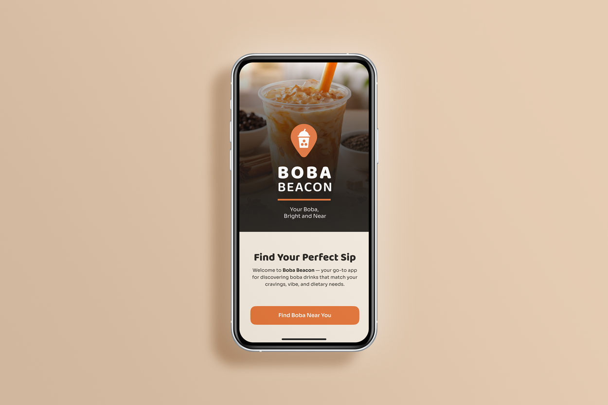
Boba Beacon
Personalized Boba Discovery App · End-to-End Mobile Application
A boba-first mobile platform designed to help users quickly find drinks and shops based on cravings, dietary needs, proximity, and shop vibe.
🛠️ ROLE
Sole UX Researcher & UX Designer
📅 TIMELINE
75 hours
🗂️PROJECT TYPE
Conceptual · Designlab UX Academy Capstone
📱PLATFORM
Mobile (iOS-focused)
🛠️ TOOLS
Figma, Adobe Creative Cloud
🌟 SKILLS
User research, affinity mapping, personas, task flows, wireframing, site mapping, prototyping, usability testing, supporting visual systems (logo, iconography, UI kit)
PROJECT OVERVIEW
The Problem
As boba shops continue to grow in number and variety, users struggle to confidently decide where to go and what to order. Menus are inconsistent, dietary options are often unclear, and existing discovery tools like Yelp, Google Maps, and social media require excessive scrolling and guesswork. This is especially challenging for users with dietary restrictions, time constraints, or specific cravings, leading many to default to the same drinks or abandon discovery altogether.
The Opportunity / Solution
Boba Beacon introduces a boba-first discovery experience centered around cravings, dietary transparency, and context. The app allows users to filter drinks and shops by flavor profile, dietary needs, location, and shop vibe, while giving vendors tools to clearly present menus, ingredients, and accommodations. By focusing on what users care about most in the moment, Boba Beacon reduces friction and helps users make confident decisions faster.
Outcome (Conceptual)
This project demonstrates how a focused, category-specific discovery tool can reduce decision fatigue, increase trust through transparency, and better support both users and small business owners within a shared ecosystem.
RESEARCH
Research Goals
Understand how users currently discover boba shops and drinks
Identify pain points related to menus, dietary information, and filtering
Learn how mood, context, and aesthetics influence boba choices
Explore how vendors communicate offerings and stand out in crowded markets
Secondary Research – Competitive Analysis
I reviewed food discovery platforms including Yelp, HappyCow, Eater, and OpenTable to understand existing patterns around search, filtering, and menu visibility. While each platform excelled in specific areas—such as reviews, plant-based filtering, or editorial curation—none were designed specifically for boba. Dietary filters were limited or inconsistent, menus lacked standardization, and vibe-based discovery was fragmented across social media rather than built into the product experience.
Primary Research – User Interviews & Research Synthesis
I conducted moderated interviews with boba drinkers representing a range of dietary needs, lifestyles, and decision-making behaviors, including users who are dairy-free, gluten-free, low-sugar, or managing allergies for themselves or their families. Using an affinity map, I synthesized recurring frustrations around dietary uncertainty, lack of transparency, and the emotional cost of making unsafe or uninformed choices.
Dietary Transparency & Trust
→ Design impact: Users with dietary restrictions struggled to quickly identify safe drink options, often relying on guesswork, calling shops, or searching through reviews—adding unnecessary friction and anxiety to a simple decision.
Reducing Guesswork & Decision Fatigue
→ Design impact: Informed the use of dietary filters early in the discovery flow and reinforced confirmation states to reduce uncertainty before users commit to a shop or drink.
While these insights primarily informed customer discovery, they also influenced vendor requirements. Because users rely on visuals to assess a shop, a vendor flow will be established to support photo uploads and clear shop presentation to set accurate expectations and build trust before a visit.
DEFINE
Personas
Three personas were drafted to represent the core stakeholders in the Boba Beacon ecosystem. The health-conscious parent persona primarily guided the customer flow, shaping decisions around filtering, dietary clarity, and speed. The boba shop owner persona guided the vendor flow, informing how menu items and dietary tags are added and managed. Together, these personas ensured the experience supported both confident discovery and accurate data entry.
Primary persona guiding the customer task flow, with a focus on fast discovery, clear dietary information, and confident decision-making.
Primary persona guiding the vendor task flow, shaping how drinks are added, tagged, and presented to build visibility and trust.
Problem Framing
Research surfaced key problem areas around personalized discovery, ingredient transparency, and cultural connection. These were reframed into guiding questions such as:
How might we help users find drinks that match both cravings and dietary needs?
How might we reduce search fatigue during on-the-go moments?
How might we help vendors clearly communicate what makes their offerings accessible?
Sitemap & Task Flows
A sitemap and supporting task flows were created to map core user and vendor journeys, ensuring alignment between discovery, decision-making, and menu management flows before moving into high-fidelity design.
Sitemap - Click to Enlarge
Task Flow - Click to Enlarge
DESIGN
Mid-Fidelity Exploration
I explored layout and structure through mid-fidelity screens in Figma to define core functionality before visual polish, prioritizing filtering clarity, menu transparency, and simple navigation. These screens focused on customer search and filtering, drink detail transparency, and vendor menu entry, while a sitemap and task flows ensured alignment between customer and vendor experiences.
Usability Testing & High-Fidelity Design
High-fidelity design refined both usability and visual identity across Boba Beacon’s most critical screens. Alongside usability testing, I developed a cohesive brand system—including the Boba Beacon logo and a custom set of dietary filter icons—to reinforce clarity, approachability, and trust throughout the experience.
Testing insights informed refinements to the primary customer and vendor screens, including search and filtering, drink detail transparency, and vendor menu entry. Visual hierarchy, iconography, contrast, and confirmation cues were polished to reduce hesitation, improve accessibility, and ensure that both users and vendors could confidently complete key tasks.
Iterations
Based on usability findings, I:
Improved contrast, spacing, icon sizing, and alignment
Clarified vendor navigation and profile switching
Added shop context to menu item previews
And
FINAL SOLUTION
Key Features
Flavor and dietary filters (fruity, creamy, gluten-free, dairy-free)
Clear ingredient and dietary labeling
Location-based discovery with map integration
Shop vibe indicators and visual previews
Vendor tools for menu management and dietary tagging
Experience Overview
Users can quickly filter drinks and shops, preview menus with confidence, and decide where to go without endless scrolling. Vendors can easily update menus and highlight what makes their offerings accessible and unique.
IMPACT & REFLECTION
Outcomes
Reduced decision fatigue by consolidating discovery into one platform
Increased user confidence through clearer dietary transparency
Created a scalable system supporting both users and vendors
Key Learnings
Small clarity cues significantly impact user confidence
Dietary transparency is emotional as well as functional
Designing dual-sided platforms requires balancing trust, accuracy, and ease of use
Future Opportunities
Test customer checkout and ordering flows
Expand vendor analytics and draft-saving
Explore social sharing and collections
Conduct accessibility-focused testing
WHY THIS MATTERS
Boba Beacon demonstrates how a culturally aware, research-driven product can turn everyday decisions into inclusive, confident experiences—supporting users, small businesses, and community connection at the same time.